How can absolute positioning build a three-column layout with a fluid middle column?
Pin a fixed-width left and right column to the window edges with position: absolute, then give the middle column side margins wide enough to clear them — the middle stays in the document flow and stretches with the window.
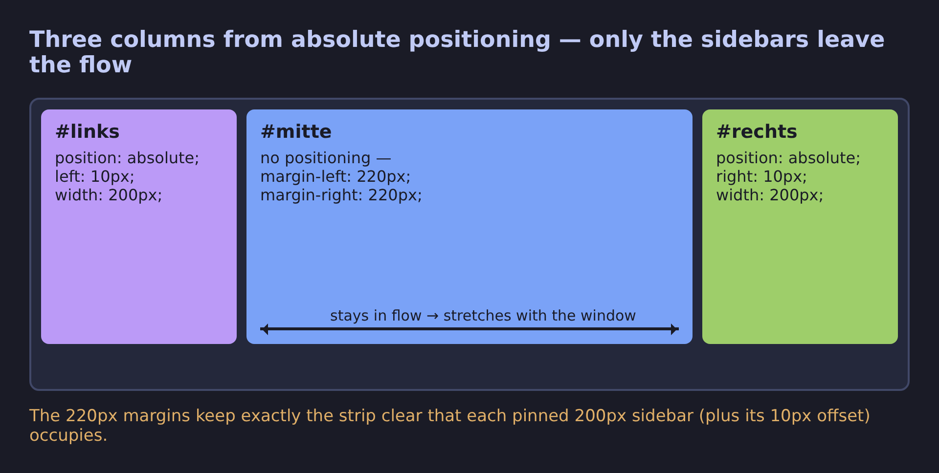
* Only the sidebars leave the flow — the middle column's margins keep their strips clear, so it stretches with the window. *
The trick is that only the two sidebars are absolutely positioned; the middle column is deliberately left in normal flow:
#links  { position: absolute; left: 10px;  top: 10px; width: 200px; }
#rechts { position: absolute; right: 10px; top: 10px; width: 200px; }
#mitte  { margin-left: 220px; margin-right: 220px; }
Each sidebar is nailed to its window edge with a fixed 200px width. The middle div has no positioning at all — it simply reserves 220px of margin on each side (200px sidebar + 10px offset + 10px breathing room), so the sidebars land exactly in the space the margins keep clear. Because the middle column is still a normal block element, it automatically spans whatever width remains when the browser window grows or shrinks — that's what makes it "fluid."
The catch: the absolutely positioned sidebars are out of flow, so they contribute no height — a long sidebar will happily overflow past the bottom of the page content — and the hard-coded 200px doesn't adapt to small screens. This is exactly the fragility that makes absolute positioning a last resort for responsive layouts; Flexbox and Grid produce the same three-column pattern without those problems.